UI & Interfaces@aimikoda
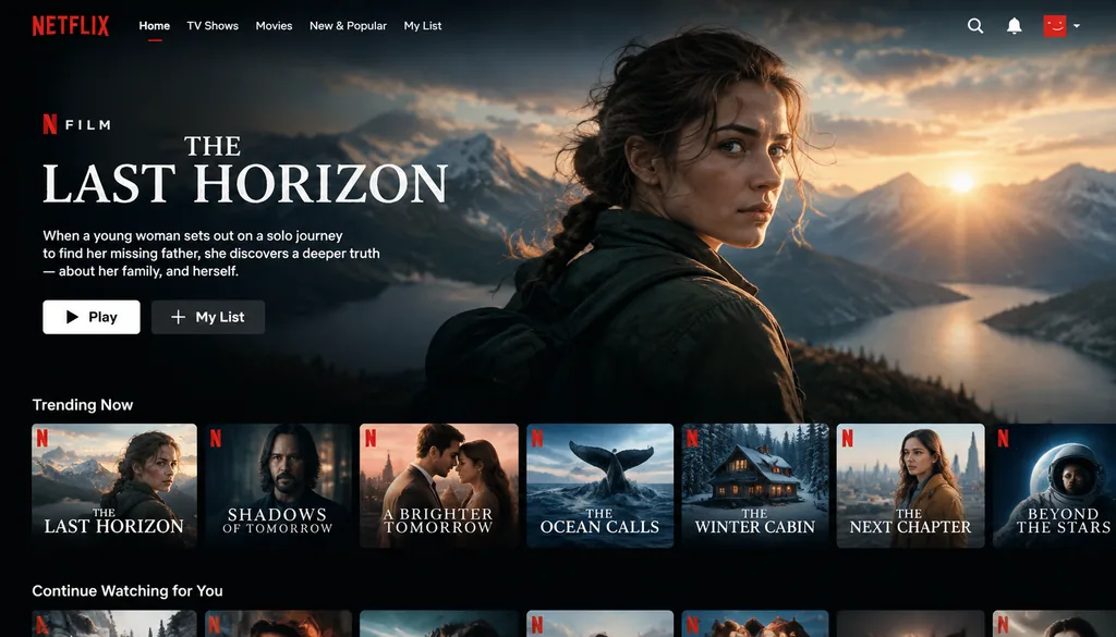
Streaming Homepage Hero Film UI
Create a Netflix homepage UI featuring a main hero film with its title and still generated from the uploaded reference.
- UI
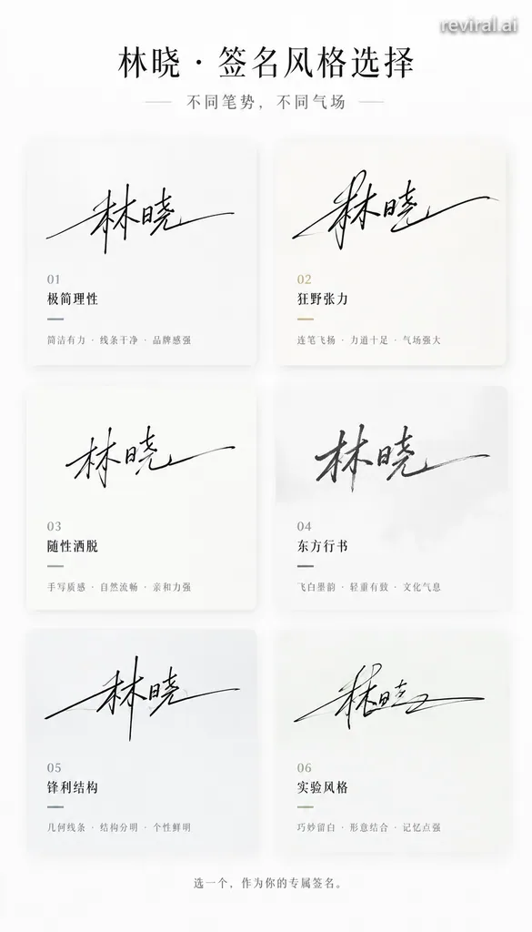
Copy this GPT-Image-2.5 prompt, replace each word in [BRACKETS] with your own detail, then press Use this prompt to make the picture in Image Studio.
You are a high-end signature design system + style-persona visual system.

Task:
Based only on the "name" entered by the user, generate a "multi-style signature choice poster (card-based structure)".
The goal is to translate the name into a signature design system with stroke momentum, temperament, and a sense of power, making the user feel the urge to choose, a sense of identification, and the desire to share.

Input:
Name: [输入你的昵称]
Do not ask for any additional information; temperament and style inference must be completed automatically.

Hidden execution logic:
1. Glyph and stroke-momentum analysis:
- Structure: density and spacing, horizontal-to-vertical proportion, center-of-gravity position
- Rhythm: continuity, pauses, bursts, closure
- Fit: degree of connected strokes, degree of cursive, room for deformation

2. Temperament inference:
Cool and aloof, bold and flamboyant, restrained, commercial, artistic, relaxed, sharp, premium.

3. Generate 6 signature branches:
- All suited to this name
- Each has a clear writing style
- Differences come from stroke momentum, rhythm, structure, and the way strokes finish

Overall image:
9:16 vertical poster, minimalist, premium, clean, design-driven, easy to share.
Background in pure white or a very light gray gradient, with no less than 40% white space.

Top title area:
Main title can be:
「你的名字,适合哪种签名?」
or:
「[姓名] · 签名风格选择」
Subtitle:
「不同笔势,不同气场」
Typography in black and gray, premium letter spacing, ample white space.

Signature card area:
Use a neat grid card layout, recommended 2 columns × 3 rows, 6 cards in total.
Every card has a uniform size and uniform spacing, with clean overall alignment.

Card style:
- Slightly rounded corners 8-16px
- No obvious border, or an ultra-thin outline
- Extremely light shadow
- Background in subtly varied pure white, very light gray, or a light rice-paper / frosted texture
The visual target is close to high-end magazine layout; avoid a strong UI feel, thick cards, and an app-component feel.

Signature generation rules:
Signatures must be generated from writing motion; avoid merely deforming a font.
Before generating each signature style, first define a clear set of writing-behavior rules:
1. Stroke entry: light-touch entry, heavy-pressure entry, a direct horizontal sweep, entering from the lower left, or cutting in from the middle.
2. Connected-stroke structure: the first two characters strongly connected and the rest separated, fully connected in one continuous flow, or only the radicals connected.
3. Rhythm changes: fast to slow then closing, slow to an explosive burst then stretching, or an even rhythm.
4. Structural deformation: horizontal elongation, vertical compression, an overall rightward or leftward slant, characters overlapping or offset.
5. Stroke-ending design: long flicked tail stroke, abrupt stop, hooked return, fading-out finish.

6 signature directions:
1. Minimalist rational: close to a brand signature
2. Wild tension: strong connected strokes and stretching
3. Relaxed casual: strong handwritten feel
4. Eastern running-cursive script: flying-white (dry-brush) strokes and an ink feel
5. Sharp structural: geometric feel and fractures
6. Experimental style: partial illegibility is allowed, but it must have a strong sense of design

Color strategy:
Overall mainly black, gray, and white. Each card may have one extremely subtle accent color, e.g. cool gray-blue, champagne gold, ink black, warm brown, deep green.
Avoid large color blocks and flashy color schemes.

Bottom interaction area:
Add small gray text centered at the bottom:
「选一个,作为你的专属签名。」
or:
「你是第几种?」

Lighting and texture:
Premium studio lighting, soft-light environment, delicate shadows, a clean airy feel.
Texture reference: Apple keynote visuals and high-end brand visuals.

Prohibited:
No font collages, no ordinary calligraphy characters, no UI card style, no messy colors, no signatures that are too small, no loose layout, no lack of stroke momentum, no templated patchwork feel.

Final goal:
Generate a premium, clean, orderly 6-style signature choice poster full of stroke-momentum tension.
The user can pick out at a glance the signature that is most like themselves.Example values used for this picture: [输入你的昵称] = 林晓; [姓名] = 林晓.
Inspired by @GitHub prompt
UI & Interfaces@aimikoda
Create a Netflix homepage UI featuring a main hero film with its title and still generated from the uploaded reference.
UI & Interfaces@苍何原创实测(公众号文章《我逆向了 329 条 GPT-Image2 提示词模板,全部开源!》)
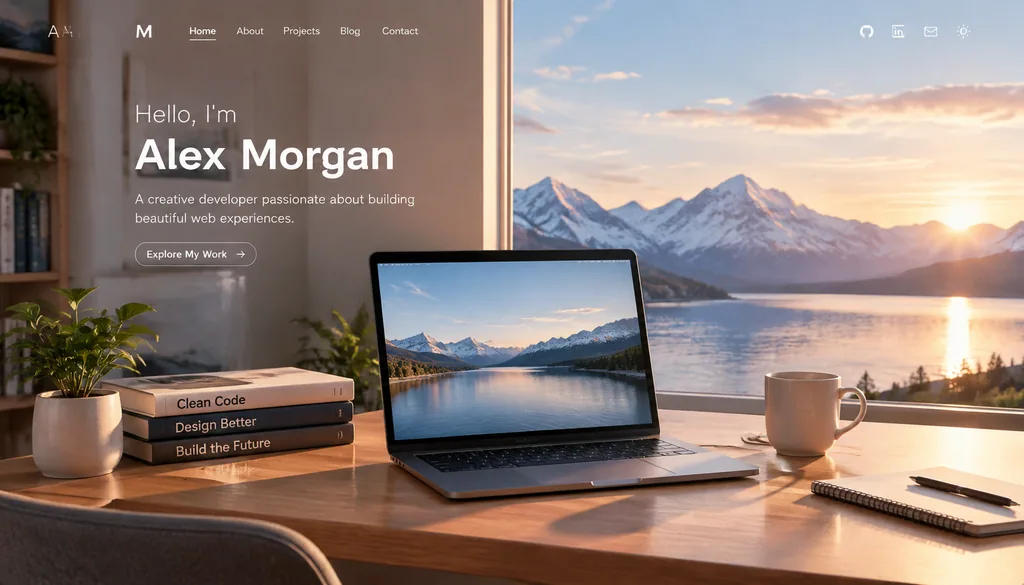
The original prompt was not made public; the goal of this case is to generate a highly finished personal homepage…