Products & E-commerce@ZetoGroovin
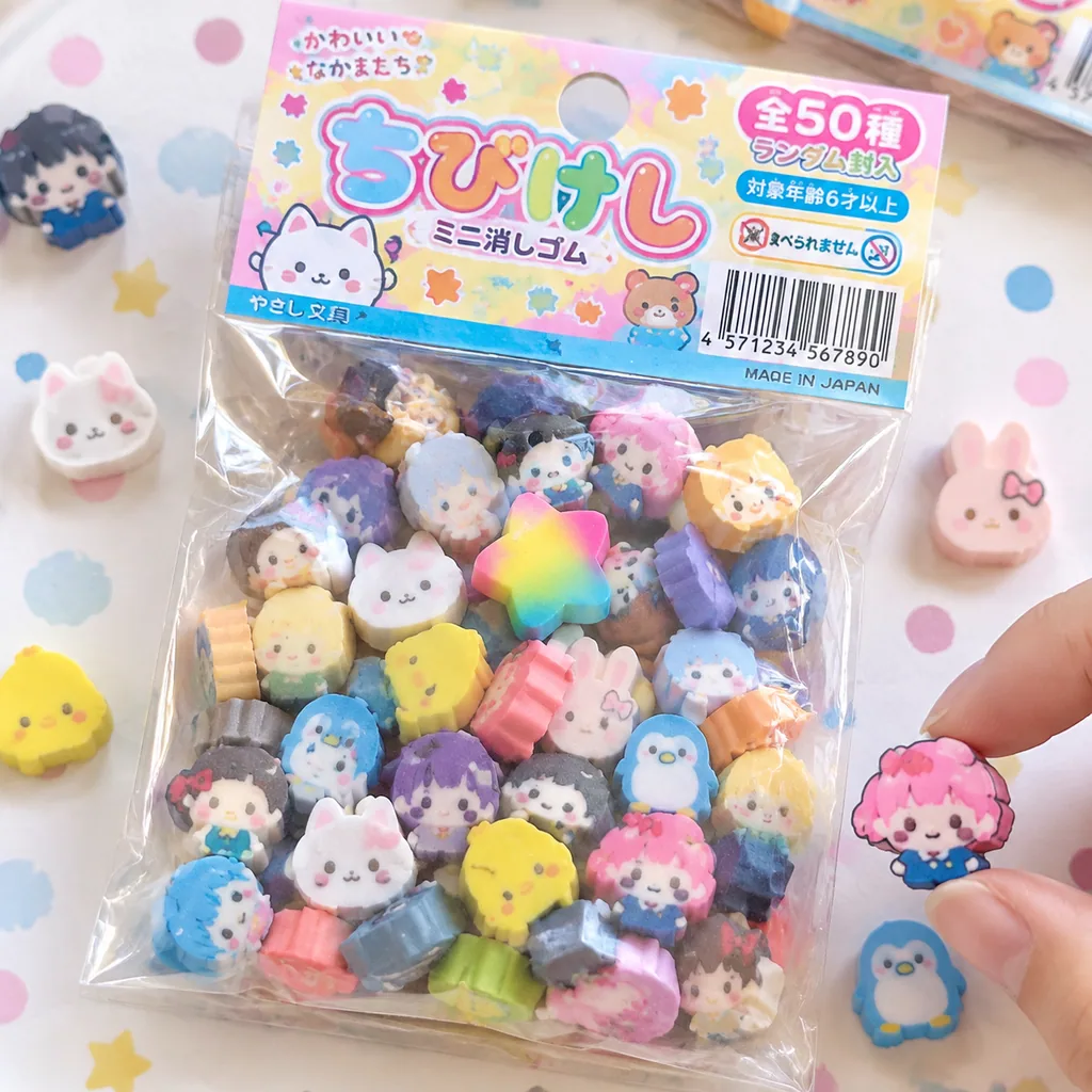
Retro Chibi Eraser Product Package
添付されたキャラクターシートをSTRICTなデザインリファレンスとして使用すること。 キャラクターの顔、髪型、目の形、プロポーションは絶対に変更しない。 ■目的: キャラクターを日本の「ちび消しゴム商品」として完全に商品化し、…
- Realistic
- Product
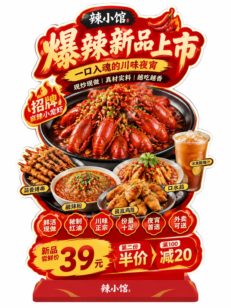
Copy this GPT-Image-2.5 prompt, replace each word in 【these brackets】 with your own detail, then press Use this prompt to make the picture in Image Studio.
《Restaurant Die-Cut Display Stand / Standee Material》 Prompt:

Please generate a highly finished 「restaurant die-cut display stand / standee」 design image, used to present a restaurant's new-item recommendations, signature products, set-meal promotions, or brand campaign information.

【基础信息】 Basic Information
Brand name: 【品牌名】
Main title: 【主标题】
Subtitle: 【副标题】
Supporting short lines: 【短句1】|【短句2】|【短句3】
Theme direction: 【主题方向,例如:爆辣夜市风 / 金黄浓郁风 / 清新轻食风 / 山野自然风 / 甜品下午茶风 / 快餐促销风】
Main color: 【主色调】
Secondary color: 【辅助色】
Accent color: 【点缀色】
Aspect ratio: 【建议 3:4 竖版】

【产品内容】 Product Content
Hero product: 【主推产品】
Supporting product 1: 【辅助产品1】
Supporting product 2: 【辅助产品2】
Supporting product 3: 【辅助产品3】
Supporting product 4: 【辅助产品4】
Add-on / side product: 【加料或配角产品,例如:饮品 / 小食 / 配菜 / 酱料 / 甜品】

【卖点标签】 Selling-Point Tags
【卖点1】
【卖点2】
【卖点3】
【卖点4】
【卖点5】
【卖点6】

【促销信息】 Promotion Information
【促销信息1】
【促销信息2】
【促销信息3】

【最重要要求】 Most Important Requirements
Avoid generating a store-scene mockup or a poster-on-a-wall display image. Directly generate “a complete display image of one finished die-cut standee”:
- The background must be pure white
- Keep only one complete die-cut restaurant standee as the subject in the frame
- No restaurant environment
- No shopping-mall background
- No glass doors, tables and chairs, walls, people, or floor-perspective scenes
- No real spatial background of any kind
- The standee must be shown in full
- The die-cut contour must be complete and clear
- The base must be fully visible
- Overall it should look like a cleanly cut-out finished store-material image / design-proposal presentation image / e-commerce display image

【画面形式】 Image Format
This is a complete design of a “store die-cut display stand / standee”; avoid treating it as an ordinary rectangular poster.
Overall it should use an obvious “irregular die-cut contour”, with a complete outer edge; the edge may have a white or light-colored outline stroke, giving it the feel of real in-store material.
The standee should have a clear base, and overall look like a finished floor-standing KT board / foam board / acrylic / photo inkjet-printed display stand.

【构图结构】 Composition Structure
Overall, use a vertical, center-focused structure with clearly layered information:

1. Top area:
Place an extra-large main title; the title must be eye-catching and impactful, with a restaurant POP-poster feel.
The typeface can be heavy, handwritten, poster-like, or trendy, but must be clear and legible.
The title is the first visual focal point of the whole image.

2. Central core area:
Place the largest hero product in the middle as the main visual subject.
The main dish must be the biggest, fullest, and most tempting, emphasizing appetite appeal.
Around the main dish, arrange 2~5 supporting products to form a rich product combination, with clear front-to-back layering and a clear primary/secondary order.

3. Surrounding information area:
Around the main dish and supporting products, add a small number of tag elements, recommendation badges, sticker frames, handwritten arrows, selling-point notes, small subheadings, small bubble tags, etc., so it has the visual characteristics of “in-store restaurant promotional material”.
But control the hierarchy, achieving “lively but not messy”.

4. Bottom promotion area:
At the bottom, place price information, set-meal information, campaign information, or new-item trial information.
Price numbers should be relatively prominent, legible and clear.
Unless specifically requested, no QR code by default.

【视觉风格要求】 Visual Style Requirements
The overall style should be “restaurant conversion-oriented visuals + in-store POP die-cut standee”:
- Emphasize appetite appeal
- Emphasize readability of information
- Emphasize real-world commercial use
- Emphasize the feel of in-store material
- Emphasize the die-cut contour

Avoid the directions of minimalist magazine posters, e-commerce detail pages, or purely flat illustrated posters.

【食物表现要求】 Food Rendering Requirements
All food must use the texture of real commercial food photography:
- Food is clear and realistic
- Visible ingredient grain and texture
- Sauces, broth, oily sheen, steam, and layering
- Rich details, such as chopped scallions, chili peppers, cheese, herbs, vegetables, fruit, shrimp, chunks of meat, etc.
- Staple foods should look full and plump, never flat
- It must look “appetizing”
Excessive illustration, cartoon styling, and low-quality collage are forbidden.

【版式与信息层级】 Layout and Information Hierarchy
The reading order of the whole standee should be:
Main title → Hero product → Supporting products → Selling-point tags → Price / campaign information

The amount of information can be fairly rich, but there must be a clear hierarchy:
- Main title largest
- Main dish second largest
- Supporting dishes slightly smaller
- Selling-point tags smaller
- Bottom promotion clear and eye-catching

【适配范围】 Applicable Range
This template needs to work for restaurant content on different themes, for example:
- Noodles / rice / rice noodles / snacks
- Hot pot / mushroom soup / regional cuisine
- Light meals / salads / coffee and simple meals
- Breakfast / set meals / fast food
- Tea drinks / desserts / afternoon tea
- Holiday promotions / new launches / bestseller recommendations / meals for two

【输出要求】 Output Requirements
Please output a high-definition, clear, commercially polished die-cut standee design image that meets the following conditions:
- White background
- Complete die-cut contour
- Complete base
- Show only the standee itself
- No real scene environment
- No people
- No store background
- No QR code by default
- Suitable for series case showcases, design proposals, social media posts, and template reuseExample values used for this picture: shown in the example prompt below.
《Restaurant Die-Cut Display Stand / Standee Material》 Prompt:

Please generate a highly finished 「restaurant die-cut display stand / standee」 design image, used to present a restaurant's new-item recommendations, signature products, set-meal promotions, or brand campaign information.

【基础信息】 Basic Information
Brand name: 辣小馆
Main title: 爆辣新品上市
Subtitle: 一口入魂的川味夜宵
Supporting short lines: 现炒现做|真材实料|越吃越香
Theme direction: Explosively spicy night-market style
Main color: Pure red
Secondary color: Golden yellow
Accent color: Black
Aspect ratio: 3:4 vertical

【产品内容】 Product Content
Hero product: Signature mala spicy crayfish
Supporting product 1: Garlic grilled skewers
Supporting product 2: Hot and sour glass noodles
Supporting product 3: Salt-and-pepper chicken wings
Supporting product 4: Mouthwatering chicken (kou shui ji)
Add-on / side product: Iced sour plum drink

【卖点标签】 Selling-Point Tags
鲜活现做
秘制红油
川味正宗
份量十足
夜宵首选
外卖可送

【促销信息】 Promotion Information
新品尝鲜价 39 元
第二份半价
满 100 减 20

【最重要要求】 Most Important Requirements
Avoid generating a store-scene mockup or a poster-on-a-wall display image. Directly generate “a complete display image of one finished die-cut standee”:
- The background must be pure white
- Keep only one complete die-cut restaurant standee as the subject in the frame
- No restaurant environment
- No shopping-mall background
- No glass doors, tables and chairs, walls, people, or floor-perspective scenes
- No real spatial background of any kind
- The standee must be shown in full
- The die-cut contour must be complete and clear
- The base must be fully visible
- Overall it should look like a cleanly cut-out finished store-material image / design-proposal presentation image / e-commerce display image

【画面形式】 Image Format
This is a complete design of a “store die-cut display stand / standee”; avoid treating it as an ordinary rectangular poster.
Overall it should use an obvious “irregular die-cut contour”, with a complete outer edge; the edge may have a white or light-colored outline stroke, giving it the feel of real in-store material.
The standee should have a clear base, and overall look like a finished floor-standing KT board / foam board / acrylic / photo inkjet-printed display stand.

【构图结构】 Composition Structure
Overall, use a vertical, center-focused structure with clearly layered information:

1. Top area:
Place an extra-large main title; the title must be eye-catching and impactful, with a restaurant POP-poster feel.
The typeface can be heavy, handwritten, poster-like, or trendy, but must be clear and legible.
The title is the first visual focal point of the whole image.

2. Central core area:
Place the largest hero product in the middle as the main visual subject.
The main dish must be the biggest, fullest, and most tempting, emphasizing appetite appeal.
Around the main dish, arrange 2~5 supporting products to form a rich product combination, with clear front-to-back layering and a clear primary/secondary order.

3. Surrounding information area:
Around the main dish and supporting products, add a small number of tag elements, recommendation badges, sticker frames, handwritten arrows, selling-point notes, small subheadings, small bubble tags, etc., so it has the visual characteristics of “in-store restaurant promotional material”.
But control the hierarchy, achieving “lively but not messy”.

4. Bottom promotion area:
At the bottom, place price information, set-meal information, campaign information, or new-item trial information.
Price numbers should be relatively prominent, legible and clear.
Unless specifically requested, no QR code by default.

【视觉风格要求】 Visual Style Requirements
The overall style should be “restaurant conversion-oriented visuals + in-store POP die-cut standee”:
- Emphasize appetite appeal
- Emphasize readability of information
- Emphasize real-world commercial use
- Emphasize the feel of in-store material
- Emphasize the die-cut contour

Avoid the directions of minimalist magazine posters, e-commerce detail pages, or purely flat illustrated posters.

【食物表现要求】 Food Rendering Requirements
All food must use the texture of real commercial food photography:
- Food is clear and realistic
- Visible ingredient grain and texture
- Sauces, broth, oily sheen, steam, and layering
- Rich details, such as chopped scallions, chili peppers, cheese, herbs, vegetables, fruit, shrimp, chunks of meat, etc.
- Staple foods should look full and plump, never flat
- It must look “appetizing”
Excessive illustration, cartoon styling, and low-quality collage are forbidden.

【版式与信息层级】 Layout and Information Hierarchy
The reading order of the whole standee should be:
Main title → Hero product → Supporting products → Selling-point tags → Price / campaign information

The amount of information can be fairly rich, but there must be a clear hierarchy:
- Main title largest
- Main dish second largest
- Supporting dishes slightly smaller
- Selling-point tags smaller
- Bottom promotion clear and eye-catching

【适配范围】 Applicable Range
This template needs to work for restaurant content on different themes, for example:
- Noodles / rice / rice noodles / snacks
- Hot pot / mushroom soup / regional cuisine
- Light meals / salads / coffee and simple meals
- Breakfast / set meals / fast food
- Tea drinks / desserts / afternoon tea
- Holiday promotions / new launches / bestseller recommendations / meals for two

【输出要求】 Output Requirements
Please output a high-definition, clear, commercially polished die-cut standee design image that meets the following conditions:
- White background
- Complete die-cut contour
- Complete base
- Show only the standee itself
- No real scene environment
- No people
- No store background
- No QR code by default
- Suitable for series case showcases, design proposals, social media posts, and template reuse
Inspired by @MrLarus
Products & E-commerce@ZetoGroovin
添付されたキャラクターシートをSTRICTなデザインリファレンスとして使用すること。 キャラクターの顔、髪型、目の形、プロポーションは絶対に変更しない。 ■目的: キャラクターを日本の「ちび消しゴム商品」として完全に商品化し、…
Products & E-commerce@iamaiistudio
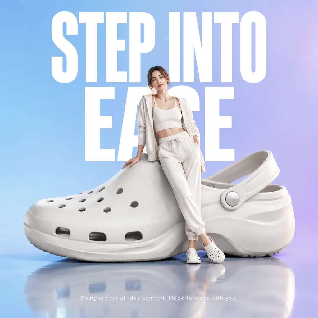
Hyper-realistic premium product advertisement: an oversized futuristic comfort clog sits on a smooth glossy reflective…