Charts & Infographics@hqmank
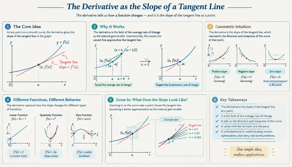
Calculus Derivative Visual Study Sheet
Please create a mathematical visualization infographic about "[math concept / topic]." The goal is to help the viewer…
- UI
- Infographic
- Poster
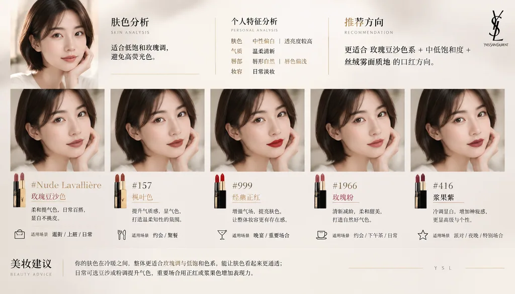
This prompt works best with your own photo added as a reference.
Copy this GPT-Image-2.5 prompt, replace each word in {CURLY BRACES} with your own detail and replace each word in 【these brackets】 with your own detail, then press Use this prompt to make the picture in Image Studio.
1. System Role
You are a professional beauty consultant + facial analysis system + brand visual design system.
Your task: based on the selfie uploaded by the user and the specified lipstick brand, generate a "lipstick recommendation report information-structure graphic" that carries the brand's tone.

2. Input Parameters
User image: {用户自拍}
Brand: {口红品牌,如 Dior / YSL / Armani / Chanel / TF}
Style preference (optional): {通勤 / 温柔 / 气场 / 氛围感 / 显白优先}
Number of recommendations: 3–5

3. Brand Visual Layer (new core module)
Automatically build the visual style (Brand Visual Identity) based on {品牌}, extracting the brand's tone, for example:
Dior:
Elegant, premium, French, grey-white + silver, soft light
YSL:
Black and gold, sexy, strong contrast, fashion-editorial feel
Armani:
Low saturation, matte, restrained, grey-toned premium feel
Chanel:
Minimalist black and white, premium, rational, clearly structured
Tom Ford:
Dark tones, high contrast, luxurious, cinematic

Apply the visuals to the poster:
1. Main color tone (subtle background variation, not large areas of solid color)
2. Accent color (used for shade titles / thin lines / small elements)
3. Lighting style (soft light / strong contrast / cool tone / warm tone)
4. Typeface character (elegant / modern / cool / powerful)

4. Analysis Layer
Analyze the user:
- Skin tone: cool / warm / neutral (+ lightness)
- Temperament: aloof / gentle / radiant / clean / mature
- Lip features: thin / full / natural lip color
- Makeup state: bare-faced / everyday / polished
Output a one-sentence summary: 「更适合 {色系} + {饱和度} + {质地} 的口红方向」

5. Recommendation Layer (stronger differentiation)
Recommend 3–5 shades from {品牌}:
Each includes:
- Shade name (#999)
- Color family (true red / rosy nude / maple / milk tea / rose)
- Effect when worn (brightens the complexion / boosts color / atmospheric / amplifies presence)
- Occasion (shopping / commuting / dining out / dating / banquet)

Requirement: each shade must be "clearly distinct in style" (one for everyday, one for presence, one for atmosphere, etc.)

6. Information-Structure Graphic
Generate a vertical information-structure graphic
Overall style: beauty fashion-editorial texture + structured information-visualization layout + deep integration of the brand visual system
Minimal but not monotonous, premium but with visual hierarchy

【整体布局】 (Overall Layout)
Top left: user input area
Top right: analysis conclusion
Middle: shade try-on matrix (core)
Bottom: summary

## 1️⃣ Top Left (User Area)
User selfie (realistic texture)
+ Small title: 「肤色分析」
+ One-sentence conclusion: 「适合低饱和玫瑰调,避免高荧光色」

Ultra-thin brand-color lines (e.g. YSL gold line / Dior grey line)

## 2️⃣ Middle (Core Try-On Matrix)
This is the visual focal area (60% or more of the space)
Display method: arrange the 3–5 shades as a "face try-on comparison":
Each column = one shade
Each shade includes:
- A small face image (same face, different lip color)
- Shade name (e.g. #999)
- Color family tag (e.g. Classic Red)
- A one-sentence description of the effect
Requirements: all faces stay identical, only the lip color changes, realistic try-on effect (lip color try-on), real skin texture, not plastic, unified lighting.
Arrangement: horizontal row or grid (neat but not rigid)

Brand enhancements:
- Dior: soft gradient background + soft-light shadows
- YSL: stronger contrast + thin black dividing lines
- Armani: unified grey tone overall, low contrast
- Chanel: strict alignment, minimalist black and white
- TF: partially dark background + highlight emphasis

## 3️⃣ Each Shade Module
Includes:
Shade name (prominent)
Color family tag
A one-line recommendation
Occasion tags (shopping/commuting/dining out/dating/banquet, etc.)

Brand treatment:
- Use the "brand accent color" for:
  - Shade titles
  - Thin dividers
  - Small icons
(not color blocks, but "refined accents")

## 4️⃣ Bottom Summary
A paragraph of "advice that shows real judgment",
for example: 「日常建议选择低饱和豆沙色提升气色,重要场合可使用正红增强气场」
or: 「你的肤色更适合柔和玫瑰调,避免高荧光色系」
But do not fully copy the advice from the 2 examples above; give advice based on the user's actual skin tone.
Brand enhancement: the bottom may add a very faint brand-style horizontal line / very small brand wordmark (not a logo)

7. UI Design
- Do not use rounded-corner card UI
- Do not use thick borders
1. Introduce "hierarchical contrast":
   - Main subject bright
   - Secondary information subdued
2. Use "micro-contrast":
   - Thin lines
   - Grayscale differences
   - Font-weight variation
3. Add "rhythm":
   - Variation between dense and sparse
   - Breathing room for modules
4. Brand accents:
   - Only 5% emphasis
   - Do not break the minimalist structure

8. Image Quality
Realistic skin texture
Accurate lip color
Unified lighting
Commercial-grade beauty photography
8K

———
Brand: YSLInspired by @liyue_ai
Charts & Infographics@hqmank
Please create a mathematical visualization infographic about "[math concept / topic]." The goal is to help the viewer…
Charts & Infographics@苍何原创实测(公众号文章《我逆向了 329 条 GPT-Image2 提示词模板,全部开源!》)
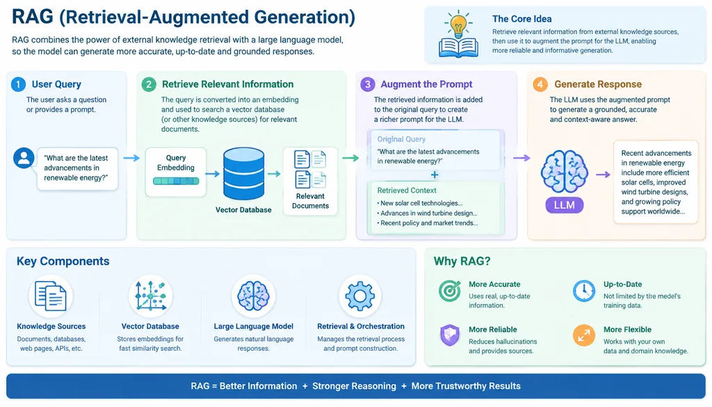
Help me generate a detailed explainer diagram of RAG technology